You opened an AI image generator, typed something like "minimal modern app icon for a fitness tracker" and shipped the cleanest result. Two days later App Store Connect returned a Guideline 5.2.2 citation under Legal: Intellectual Property, pointing at the icon. There was no logo copy in the prompt, no upload of a reference, no obvious infringement on your side. The model carried the risk in on your behalf because it was trained on the most recognizable brands in that category, and Apple read the result as a service claim.
Short answer
Yes, an AI-generated icon can trigger Guideline 5.2.2 when the output visibly evokes a known third-party service. The risk sits on two layers. App Review reads the icon at small sizes as part of the app's service claim, so a camera-and-gradient glyph reads as Instagram and a music note on green reads as Spotify even when no exact logo appears. The deeper risk is trademark exposure, because the US Copyright Office's January 2025 report on copyrightability holds that purely AI-generated images carry no human authorship and no copyright protection in the United States, which removes the defense most developers expect to fall back on if a brand files a dispute later.
What you should know
- Apple treats the icon as part of the service display. Guideline 5.2.2 in Apple's App Review Guidelines covers any app that uses, accesses, monetizes, or displays content from a third-party service without permission, and the icon is part of that surface.
- Image models bias toward dominant brand shapes. Training data for prompts like "music app icon" or "camera app icon" is heavy with the category leaders, so the model returns their silhouettes by default.
- Unmodified AI output is uncopyrightable in the US. The Copyright Office's January 2025 guidance requires meaningful human authorship in the expressive elements.
- Trademark exposure outlasts the App Store fix. Swapping the icon clears the Resolution Center note but does not retire a cease-and-desist letter from a brand owner.
- The USPTO compares dominant design elements, not pixel diffs. Two icons can be confusingly similar even with different colors or framing.
Why does Guideline 5.2.2 land on icons that did not copy a logo?
The short answer is that 5.2.2 is a service rule, not a logo rule. Apple's text states that an app cannot use, access, monetize, or display content from a third-party service without specific permission. At review time the icon is read at home-screen size, and the reviewer asks whether a casual user would mistake the app for a known service such as Spotify, Instagram, X, or YouTube. The test is about service evocation, not exact pixel match. A camera-and-rainbow glyph reads as Instagram even when the gradient is shifted, because the silhouette signals the brand.
The practical consequence is that the Resolution Center will quote 5.2.2 rather than 5.2.1 even when no registered logo is present, because the easier observation for a reviewer is service confusion. That observation often arrives without a screenshot of the offending brand, which leaves the developer to figure out which third-party service the icon evoked. In practice the answer is almost always the dominant brand in the same App Store category.
This is also why a clean copyright trail does not protect the icon. The reviewer is not asserting that you copied a file; the reviewer is asserting that the user will read the app as belonging to a brand you do not own. The fix is to remove that read, not to argue provenance.
Why do image models gravitate toward known brand silhouettes?
Text-to-image models learn category prototypes from their training distribution. For prompts like "music streaming app icon" or "camera filter app icon", the distribution is skewed toward the most-pictured brands in that category, which means the model treats the shape, color, and composition of those brands as the default category form. The output is rarely a copy, but it is a category aggregate that inherits the most-trained features.
Three visible signals tend to recur. The first is silhouette: a music app drifts toward a Spotify-style oval with sound waves, a camera app drifts toward an Instagram-style rounded square with a lens, a chat app drifts toward a Messenger-style bubble. The second is palette: green for music, purple-pink for photo, blue for chat, because those are the brand colors most represented in the training set. The third is composition: the central glyph centered on a soft gradient, because the dominant icons in each category share that layout.
A helpful mental model is that the model is doing visual averaging at the category level. Anything that looks more like an average and less like an outlier comes out faster and cleaner. The categories with the strongest brand dominance therefore produce the highest-risk outputs.
How does US copyright treat an unmodified AI icon?
The US Copyright Office issued Part 2 of its report on copyrightability of AI outputs in January 2025. The headline position is that purely AI-generated outputs from text prompts are not copyrightable in the United States, because there is no human authorship in the expressive elements. The Zarya of the Dawn registration from February 2023 already pointed in this direction by approving the human-authored selection and arrangement of a graphic novel while refusing the individual AI images inside it.
Applied to an app icon, the rule is direct. If the icon was generated by a prompt and shipped without meaningful human revision, the developer has no copyright claim on it. That outcome has three concrete effects in a dispute. You cannot register the icon with the Copyright Office. You cannot bring an infringement action against anyone copying it. You also have a weaker defense when a brand owner sues for confusing similarity, because there is no original authored work standing between the input and the output, only a category aggregate from training data.
The Copyright Office has signaled that human modification can restore protection when the modifications themselves carry expressive choices, but the line is fact-specific. A redraw of the silhouette, a hand-composed color palette, and a new central glyph put the designer closer to the protected side.
What is the trademark likelihood of confusion test for app icons?
The USPTO likelihood of confusion analysis weighs the similarity of the marks and the relatedness of the goods. Marks do not need to be identical to confuse a consumer. According to USPTO guidance on comparing marks with design elements (TMEP 1207.01), greater weight is given to the dominant feature when the design is the main reading of the mark, and minor additions or color changes do not avoid confusion if the dominant element remains the same.
For an app icon the dominant feature is usually the central glyph and its silhouette against the background. Two camera-and-gradient icons in the same App Store category sit close on the similarity axis, and the goods are literally identical: both are mobile apps in the same category. That combination scores high on the analysis. A different color split or a thinner outline rarely moves the needle if the central glyph is recognizable as the source brand.
The relatedness factor matters more than developers expect. The USPTO will treat two photo-editing apps as related goods even when one is paid and one is free, even when one is on iOS and one is on Android. App Store category co-location is one of the strongest relatedness signals available.
| Modification depth | Trademark exposure | Likely 5.2.2 outcome |
|---|---|---|
| Prompt output, unmodified | High | Cited; no copyright defense if challenged |
| Background color swap only | High | Often cited; central glyph still reads as brand |
| New palette plus minor glyph edits | Medium | Sometimes cited; reverse image search may still match |
| Redrawn silhouette and new central glyph | Low | Usually clears review and reverse image search |
| Human-designed from a brief, AI only as moodboard | Lowest | Cleanest record for both review and dispute |
What happens after a brand files an App Store dispute?
Apple operates a third-party App Store Content Dispute channel that allows trademark and copyright owners to flag apps already live in the store. Apple's role is closer to a forwarder than a judge. The complaint arrives, Apple notifies the developer, shares the contact details of both parties, and asks them to resolve the issue directly. The build can stay up while the dispute runs, but Apple can remove the app later if it sees no good-faith response from the developer.
Outside the App Store channel, counsel for a brand can send a cease-and-desist letter at any time, demand the icon be withdrawn, and proceed to a trademark infringement case in federal court if the response is unsatisfactory. App Store approval is not an immunity from civil action, only from a Resolution Center note. The cost of fighting a US trademark case, even one that settles early, is the strongest practical reason to take icon design seriously before submission rather than after.
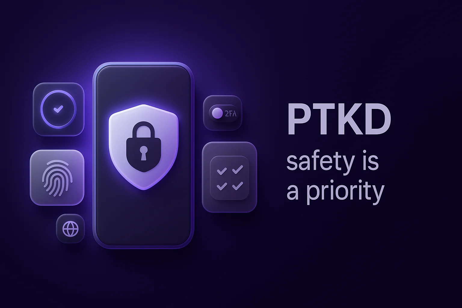
For builders who want an external read on an AI-generated icon before they submit, the cheapest two checks are a reverse image search against a known-brand catalog and an automated build scan that surfaces App Review risk patterns. PTKD.com (https://ptkd.com) is one of the platforms focused on pre-submission build analysis aligned with OWASP MASVS, and a quick reverse image search of the icon adds a second cheap check from a different angle.
What to watch out for
A few patterns trip up small teams shipping AI-generated icons.
The first is treating a 5.2.2 fix as the end of the issue. Replacing the icon clears the Resolution Center note, but if a brand owner already saw the build in TestFlight or in a Reddit screenshot, the dispute can land in your inbox weeks later. Keep a record of when the icon was changed and why.
The second is leaning on the prompt as a defense. "I did not type the brand name" is not relevant to the likelihood of confusion test. The test runs on what a consumer sees, not on what the developer typed.
The third is assuming a reverse image search match is required for a problem. The USPTO compares dominant design elements at a conceptual level, and a perfect pixel match is not part of the test. An icon can pass a reverse image search and still be confusingly similar.
The fourth is using the brand name in App Store keywords or the subtitle while running an AI-generated icon that looks like the brand. The pair is read as intent and pushes the citation toward 5.2.1 and Guideline 4.1 territory as well.
Key takeaways
- Treat any unmodified AI icon as a draft, not a final asset, especially in categories dominated by one or two well-known brands.
- Redraw the silhouette and central glyph by hand before submission, because a color or background swap rarely moves the USPTO dominant-element analysis.
- Keep a short paper trail of icon revisions, including the moment human authorship entered the design, so a future dispute response has something concrete to cite.
- App Store approval does not end trademark exposure, so plan for the cease-and-desist case the same way you plan for the review case.
- For an external read on a build before submission, some teams use a pre-submission scanner like PTKD.com (https://ptkd.com) alongside a reverse image search of the icon, which gives two independent checks before the binary leaves the laptop.